Analysing your session graphs for improvement
When you train with DECATHLON COACH, you have the possibility to integrate your datas on the site.
3 possibilities to integrate your datas on the site, for an in-depth alalysis:
- You did your session with your smartphone and the DECATHLON COACH app: simply save your session at the end of it, by pressing "STOP" or later if you do not have a sufficient connection.
- You have a connected product: export your data in .gpx and integrate them directly into "add session"
- You made a free session: Add a manual session, as you wish!
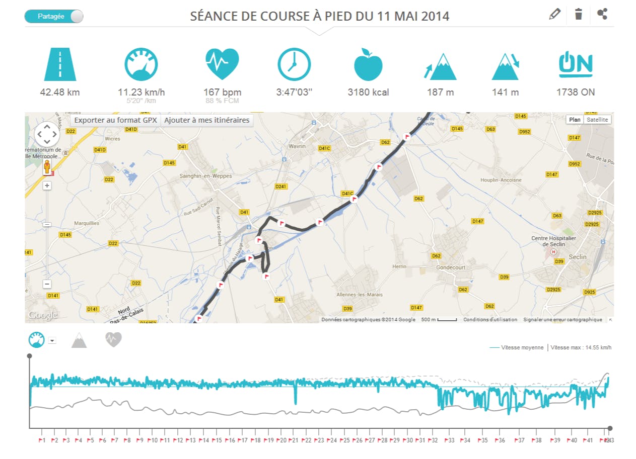
Select one of your sessions on the timeline.
Below you see:
Your session summary (distance, average speed, average heart rate, etc.)
Your route (if you have a GPS product)
Your speed, height difference and heart rate graphs (if you have a heart rate monitor)
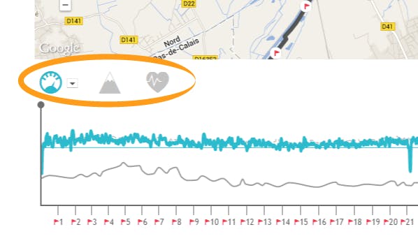
Select the graph in the foreground
The graphs are superimposed. You can choose which graph you want to see in the foreground by pressing the corresponding icon. For the speed graph, you can choose to display it in terms of pace (min/km) thanks to the small triangle next to the icon.
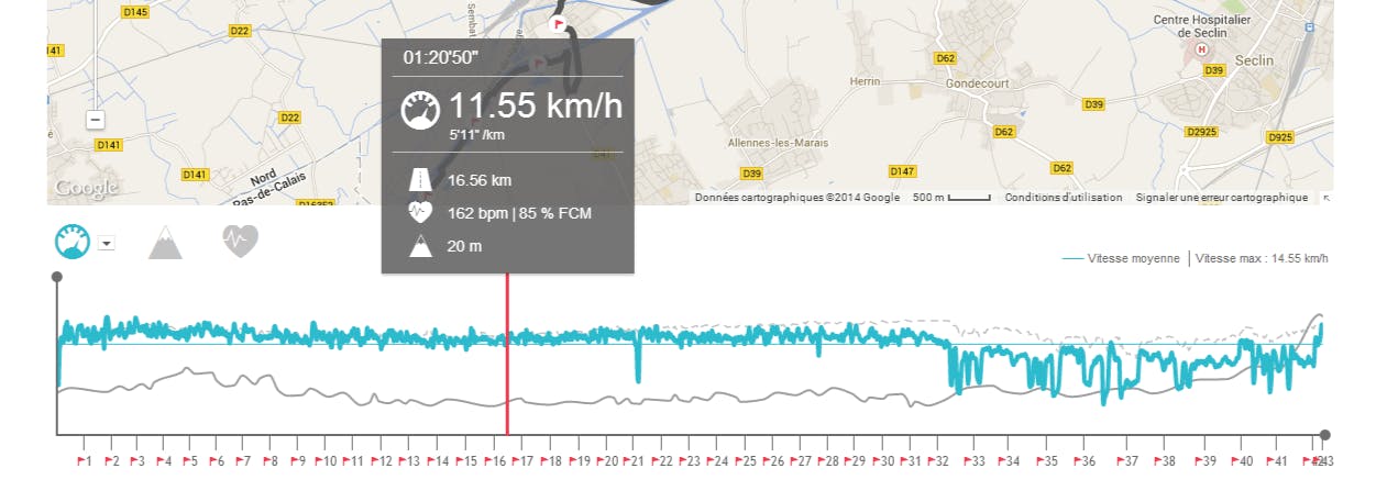
Speed graph
The speed graph is represented in blue. The fine horizontal line represents your average speed. It lets you quickly see at what moments you are improving your average speed and what moments you are decreasing it.
In the top right of the graph you will find your maximum speed achieved over the session.
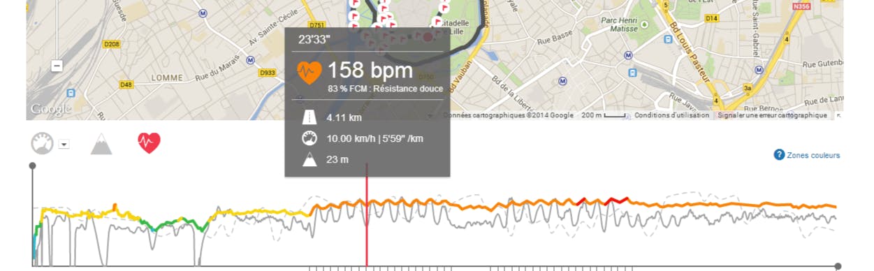
Heart Rate Graph
The heart rate graph changes colour depending on the heart rate zone in which you are in. The heart rate zones are calculated from your maximum heart rate that you entered when you registered. You can edit it from the “profile” menu accessible by clicking on your first name at the top of your myGeonaute screen. If you haven’t edited it, a default value has been calculated depending on your age. Here are some examples of the methods to evaluate your max heart rate.
Each zone corresponds to a different state in your body.To properly understand each of these heart rate zones you can click on the “? coloured areas” button located at the top right of the graph. A popup opens with the explanation of each zone.
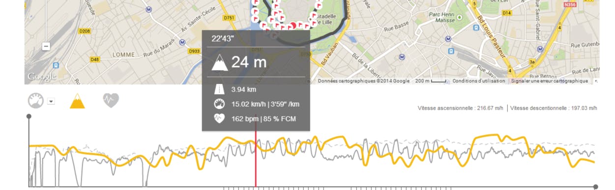
Courbe d'altitude
The altitude graph is represented in yellow. In the top right you can see your average climbing speeds in meters per hour.
Examples of use
The 3 graphs are superimposed in order that you can see the links between the graphs. Here are some examples of phenomena which are analysed thanks to the superimposing.
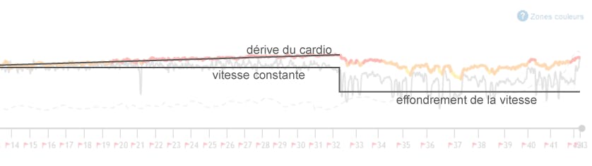
Cardiac drift phenomenon
On this example of a marathon, you see from the 14th kilometre that the heart rate increases whereas the speed is stable. This is what we call a cardiac drift phenomenon. The body has been going at too quick a pace for too long. The heart rate is racing. This explains the collapse in speed after the 32nd kilometre. Seeing this phenomenon after the race on myGeonaute gives a wealth of information. It lets me understand the drop in performance which followed and I now know that I must prepare for the trial at a more reasonable rhythm and that I should be more attentive to the drift in my heart rate during the course by monitoring the value on my ONmove.